MAJOR PROJECT - BERDAZZLE
1.jpeg)
Luisa Audrey / 0348741 / Bachelor of Design in Creative Media (UI/UX)
Major Project
Berdazzle
INSTRUCTION
PROGRESSION
IDEATION:
In the first week, we received a briefing about the requirements and the rules for producing our major project. Sir Asrizal informed us that to create the major project, we needed to either solve a problem, collaborate with a company, or build on our research dissertation. A surprising update was that, starting with our batch, group projects were now permitted.
After hearing the briefing, I found myself debating whether to work on the major project individually or as part of a group. I'm aware that group work isn't my strong suit, but the idea of creating a larger project, which would require more contributors, was appealing. Ultimately, I decided to form a group with Esther and Michelle.
During our first meeting, we brainstormed and explored various ideas, ranging from an app for the elderly to a tracking app for parents to monitor their kids.

However, Sir Asrizal rejected this idea, pointing out that there’s no real purpose in tracking kids' gadget time if, ultimately, they’re still using the device. He suggested that parents could simply take the phone away instead of relying on a tracking app. He also emphasized that UI/UX students don’t always have to create an app; we could explore other innovations, like the coffee vending machine at Taylor’s.
Taking his feedback into account, we decided to brainstorm more ideas. Eventually, we landed on the concept of recycling. We thought it would be beneficial to develop an idea for a recycling machine in Malaysia. This machine would allow users to monitor their recycling habits and earn points for their efforts. Here are the details of the concept:

However, when we proposed this, the idea was once again rejected. Sir Asrizal suggested that instead of creating the machine, we should position ourselves as intermediaries, similar to what 'Grab' does. He then referred us to Sir Razif for further guidance.
Before our first meeting with Sir Razif, the three of us decided to each come up with one idea to speed up our progress. During this time, I thought of a 'girl app'—an app designed for busy women to book beauty services for special occasions. The concept was to help women manage their time more effectively, as preparing for certain events can take a significant amount of time, sometimes even up to a week.
While I was developing the app idea, Esther came up with a concept for rental clothes, and Michelle suggested an app for wedding planning. When we presented these four ideas to Sir Razif, including the recycling one, he asked us to decide which idea to pursue, as he didn’t want to choose between them. However, he did suggest combining my idea with Esther's. In the end, we followed his suggestion and began developing the plan.
We started by looking for moodboard, color palette, and typography. Here are the overall moodboard:


Following this, we decided to divide our tasks. I took responsibility for branding, Esther handled iconography, and Michelle was in charge of the UI. During our discussions about branding, Esther suggested the name 'Accio.' This name is inspired by a spell from the Harry Potter movies that summons objects or people when it's spoken. Here are the logos I created for 'Accio'
However, after conducting some research, I discovered that 'Accio' is a trademark owned by Warner Bros., so we couldn't use it. With this in mind, we decided to come up with a new name. Initially, we considered 'Omorphile,' which means beauty, but after saying it a few times, it started to sound like a medication name, so we moved on.
We then thought about using the word 'Dazzle.' Since 'Dazzle Me' was already taken, we considered 'Dr. Dazzle,' but Esther wasn't fond of it. Finally, she suggested 'Berdazzle.' By adding the Malay prefix 'ber-', we felt it would enhance the inclusivity for the Malaysian audience. Once we agreed on the name, I began working on a new logo.
Here are the logos I designed:

At first, they said that the last one was better. So I started developing the mascot and adding the logo versions based on it.

After doing it a few times, I was still not satisfied. The mascot looks too kiddy and the font doesn't seem to fit the name. Therefore, I decided to change to the second logo.


Here are some of the UI low-fidelity screens that I created. Here are the flows that I created:
- Booking service
- Booking rental
- Explore Pages
- Schedule Planning

Afterward, Michelle and I started adding colors to the screens while Esther focused on the AR. Here are the screens I created:


Despite having most of the pages completed, I still wasn’t satisfied. I felt the app looked somewhat plain, but I was conflicted because our original goal was to create something that appeared both elegant and playful. I kept overthinking how to improve the app until we consulted with Sir Razif. He mentioned that our app lacked anything special and looked mediocre. My overthinking intensified when, during our progress presentation, most of the lecturers expressed disappointment, feeling we could have delivered more.


I also ended up doing the navbar:
Afterward, Michelle and I started adding colors to the screens while Esther focused on the AR. Here are the screens I created:
I also made most of the illustrations inside the app. Aside from that, I also created the onboarding:

Here is the overall app:
Here is our progression presentation slide:
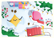
BERDAZZLE Presentation by luisaaudrey22Initially, I thought our project lacked variety, so I created additional illustrations for Beauchi. During this time, I also began differentiating Beauchi's shapes based on each occasion. Here are the pairings:
- Star = Default
- Circle = Makeup expert
- Spikey = Nail expert
- Peanut = Hair expert
- Cloud = Clothes expert
- Triangle = Color expert
I consulted with a friend about the app, and he suggested that I consider rebranding. He mentioned that it’s nearly impossible to create an elegant and playful app. Taking his advice, I decided to design a more playful logo. Here is the new Berdazzle logo.
However, Esther suggested that we change the b into a capital B. Someone also suggested that we change the star to a yellow color.

After updating the logo, I noticed that "Berdazzle" now has a more rounded and playful appearance. Consequently, I chose to modify Beauchi's shape to have rounded edges as well. Additionally, I incorporated a gradient to reduce monotony and added a grain texture, which proved to be an excellent finishing touch for the overall branding. Here is a comparison between the old Beauchi and the new Beauchi.

After changing the branding and mascot, I changed the pages to be more colorful. Here are some of the pages that I changed:


Users can now view the types of services that each artist offers. During the booking process, they can select services for each person based on the pricing page. Additionally, I repositioned the "add to cart" option so that users can choose which service they want to book first.
Here are all of our screens after Esther connected them:

During these times, I also created the key visual for the booklet and presentation board. Here is the booklet KV that I created:

For the presentation board, I created it together with Michelle:

Before we changed the branding, Esther already made our microsite. However, we needed to redo some parts to fit the current branding. Here is the previous design made by Esther:

I changed the home page into something like this:

However, sir Razif mentioned that our microsite looks like a game site. He suggested that we add "people" to show that we are selling service. Here is how I changed it:

.png)


Lastly, Michelle enhanced the entire website using the assets that Esther and I created. Here is the final version of our microsite:
.png)
We also produced merchandise and managed our social media presence. I focused more on the merchandise, while Michelle took charge of the social media. Here is a list of the merchandise we created:
- Postcard
- Sticker sheets
- Die-cut stickers
- Mystery box
- Keychain
- Phone strap charm
Additionally, we ordered other merchandise from Indonesia, including:
- Pillow
- Plushie keychain
- Phone strap
- Totebag
- T-shirt
I was responsible for creating all the illustrations and assets for the merchandise, except for the keychain background, thank you card, and the back of the postcard.
Here are the designs I created:
Postcards:


Sticker sheets:


Dye cut stickers:


Keychain & Phone strap charm:

Totebag:

T-shirts:


I also created the first 3 posts for Instagram:

Here is the end result of our Instagram that Michelle mostly created:

After I was done with the video, I utilized my time to prepare for the showcase. Here are the pictures of us during the showcase and our booth:


Here is our final presentation created by Esther and Michelle:
MP Final Deck by Michelle Angeline (miichymouse)Here is our Figma file for the app:
FEEDBACK
Sir Asrizal:
During our discussions with Sir Asrizal, we went back and forth on the ideation process. Initially, we proposed a kids' tracking app that would allow parents to monitor screen time and remind kids to take breaks from their devices. However, he pointed out that this might be unnecessary since parents could simply take the devices away. He also mentioned that content for kids isn't necessarily better than regular content and gave us an example involving a coffee vending machine, emphasizing that creating an app isn't always the solution. He suggested we consider a model similar to "Grab" and avoid producing the end product ourselves.
After receiving this feedback, we brainstormed a recycling-related idea, thinking it could address a global issue while innovatively improving Malaysia's recycling system. However, Sir Asrizal wasn't keen on this idea either. He reiterated the importance of considering a middleman approach, like "Grab," and reminded us that, as a group of three, higher expectations would be placed on us. Following this, he referred us to Sir Razif.
Sir Razif:
After being referred to Sir Razif, we developed three ideas: a rental app, a bridal app, and a girls' app. Sir Razif suggested combining the girls' app with the rental app to create a one-stop shop. We then proposed the name "Accio" and planned our goals, target audience, competitors, and features. After completing most of the screens, Sir Razif noted that the app looked plain, which led me to rebrand and retouch the entire design. While he acknowledged our improvement, he also mentioned that the app was starting to look too playful, almost like a game rather than a service platform. He recommended adding people to the key visuals to emphasize the service aspect and suggested creating social media accounts to promote the app.
In our final consultation, Sir Razif gave us additional feedback:
- Move the bio to the top
- Add a cart indicator to the button
- Change the dropdown to up-and-down buttons in the cart
- Add another total below the separation page
- Make all sections clickable when choosing a service
- Change the explore icon
- Add a copy for order status and replace "back" with "exit"
- Modify the "add service" button in the schedule
We managed to implement some of these changes, but due to time constraints, not all of them were completed.
REFLECTION
Surprisingly, the major project has become my favorite module so far. Although the journey was challenging, the experience and enjoyment I gained were truly valuable. There were aspects of Berdazzle that I wish I could have fixed, but I have to admit that time constraints prevented me from addressing everything before the showcase. After reviewing and retesting the app multiple times, I discovered several issues and realized that I could have improved the website's content to better promote the app. I also felt disappointed that I didn't manage to post all the Instagram content to fully promote our idea. The one aspect I’m quite satisfied with is the merchandise. Despite the sacrifices I made throughout this project, I’m proud of what I accomplished.
Working on group projects, especially as a trio, has its ups and downs. Since there weren’t many groups of three, the expectations placed on us were higher. I debated whether to work individually or in a group, knowing it would be less stressful to do it alone. However, I wanted to tackle a bigger project, which required working with others. We faced numerous disagreements, and our friendship was tested, but I maintained the principle that work should remain professional. I couldn't always soften my feedback, as I was focused on what was best for Berdazzle. Despite the challenges, we managed to resolve our issues and complete our tasks. Although the final result wasn’t perfect, I’m still proud of what we achieved. I want to thank my teammates for their support throughout the project and for helping me grow from my mistakes.


Comments
Post a Comment