ILLUSTRATION & VISUAL NARRATIVE

Luisa Audrey / 0348741 / Bachelor of Design in Creative Media
Illustration and Visual Narrative
Illustration and Visual Narrative
Lecture
Week 1 :
Today was the first IVN class with Miss Noranis and Miss Jennifer. Miss Noranis introduced us to the module along with our tasks for the whole semester.
The first task we received was the vormator challenge. We were instructed to make a character design sketches with a limited amount of 8 shapes.
Week 2 :
What makes a Character Unique?
PRINCIPLE OF CHARACTER DESIGN
1. Shapes
- Shapes define a character's silhouette! If you can recognize the character through the silhouette, it means that the character is good and unique. This is what sets the iconic look!

2. Color
- Colors have qualities that can cause certain emotions in people!

3. Emphasis & Contrast
- A good character design is when you pick one visual element in a character and exaggerate it, making the character outstanding and memorable.

4. Harmony
- All shapes, lines, colors, motifs, patterns, must be put together in a tasteful manner.

5. Expression/Poses
- What makes your character win the heart of the audience is their behavior/quirks/personalities that are visually shown.

COLOR STUDIES

Week 3
Week 3:
VISUAL TECHNIQUES: COMPOSITION
Types of composition:
- Establishing

- Bird's Eye View

- Framing

- Medium Shot

- Close-up

- Worm's Eye View

A Balanced Distribution of Positive and Negative Spaces

Industry Technique:
- Find a Balance of Negative and Positive
- Visual Hierarchy


VISUAL TECHNIQUE: COMPOSITION (2)
Paintings before the 14th century:

The art of Byzantine, Medieval, and Gothic periods was rich and beautiful, but the images made no attempt to create the illusion of depth and space.
The painting looks beautiful and rich, however kind of dorky and has no perspective.
Until Maverick, Fillipo the architect came

Masaccio - Tribute Money c. 1426-27 Fresco, The Brancacci Chapel, Florence

"The Last Supper" - Da Vinci

"The School of Athens" - Raphael

Leading all the way to the Renaissance Period (14th - 17th Century)
What is Perspective in Art?
- To create depth
- An illusion
- A representation of Objects (From a 2D surface, to create a 3D optical illusion)
Types of perspective:
- 1 point
- 2 point
- 3 point
- 4-5 points (fisheye)


Week 5:
VISUAL TECHNIQUES : CHIAROSCURO
Chiaroscuro: Chiaroscuro refers to the use of light and dark to create the illusion of three-dimensional volume on a flat surface. ("chiaro"= bright, "scuro"= dark)


Why is Chiaroscuro is used?
- Increase dramatic tension
- Create sensational effect
- Pull your attention to a subject in an intense way
- Create a tasteful composition of negative vs positive spaces
It's also a great study of form and value practice
RHYTHM & MOVEMENT
Having rhythm in art is one of the most difficult aspects to achieve/explain

good rhythm = good movement
Basic visual elements to create movement and shape and lines


Instruction
<iframe src="https://drive.google.com/file/d/1Opf-2RZYBeFPKkCh03DrOTw0H0pmjJgy/preview" width="640" height="480" allow="autoplay"></iframe>
Exercise:
We were instructed to make sketches for our character design.
Here are the original character sketches I made.
 |
At first, I was still in a dilemma on which one I should choose. However, after I attended the week 2 class and looking at other's artwork including comments and feedback, I decided to go with Pinky Piper.
At that moment, I was not quite satisfied yet with Piper's design. I feel like her name does not really represent her look, so I developed her design and character details into this.
After getting the second sketch done, I decided to color her. I was aiming for a cute and adorable look on Piper, so I chose the softer color palette.

After I was pretty much done with the designing and planning, I decided to think of a way to change Piper into a vormator character in Adobe Illustration.
After few arrangings, I managed to figure out the way.

Here I also showed how I made each part of Piper's body from only vormator's 8 shapes.
In the end, this is the final result I could get.


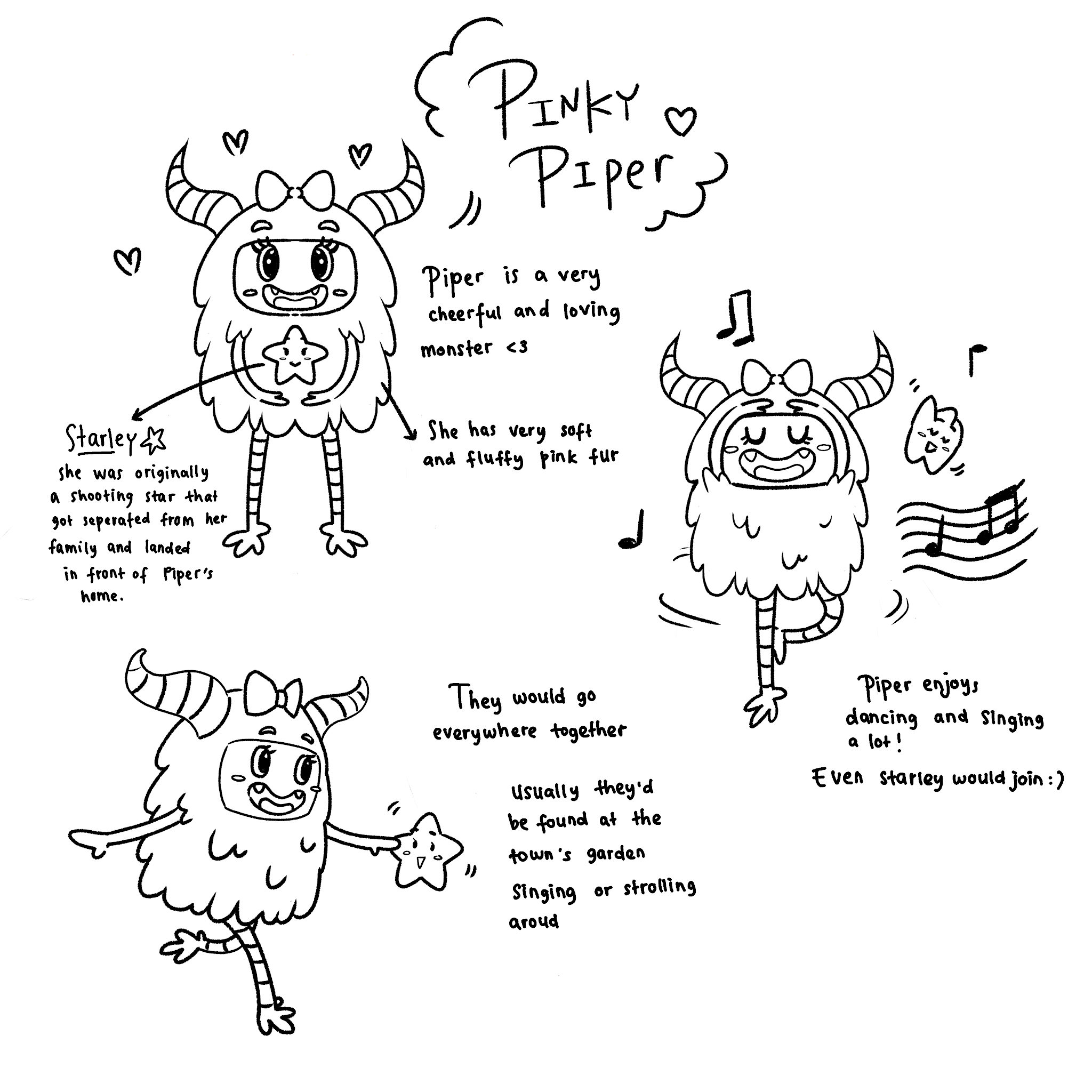
Character's short background story :
There was once a shy little kid that lived in a town of monsters, her name was Pinky Piper. But Pinky Piper has always been avoided by the citizens of Monsterville, poor Pinky Piper was adorable compared to the frightening monsters that lived in the town. She felt lonely, not only was she avoided, but her monster parents are always busy. Without friends nor family to be with, she decided to spend her alone time in a forest near her house. She lived her life singing and dancing alone to mend her broken heart, but sadly to no avail. Until one day, she let out a gasp as she saw shooting stars, many of them in fact. The beautiful gleam of the falling stars enthralled her, and then realized she should make a wish. "Oh starlight, let my wish come true and grant me a dear friend," she said. As soon as she said the final word a shooting star brighter than the rest fell from the heavens. But it wasn't brighter, no it was closer! The falling star lit up the gloomy night as if for a second it was day again, and there was a crash heard near her house. She hurriedly ran to it as fast as her little legs could go and to her surprise was a starlet. The little starlet she found was weeping, and little Piper slowly walked over to it. "What's wrong little thing?" she asked, to which the starlet replied, "I- I was sniffle separated from my family, I got here by accident". Pinky Piper knew of this feeling, it was the gloomy feeling that broke her heart. Pinky Piper then reassured the starlet, she told her that she can be her friend. "From now on, I'll call you Starley!". As time passed, the both of them grew comfortable with each other and decided to be companions forever. Ever since then, Pinky Piper is no longer a quiet kid, instead she is now the friendly and happy monster, thanks to her best companion Starley.
So after I have completed the character making and the story, I decided to think of the card design. These are the references that I took from the internet.


I liked the idea so I tried to make it the completed version from my tablet with the right size.


After making the first attempt, I realized that the back card couldn't look similar to the front card. So I kinda revise it and make the background looked kinda different.

I did few more attempts until I finally came up with this idea.

After this, I moved the design to Adobe Illustrator.


This is the final result:
 |
| Front design |
 |
| Back design |
Feedback
Week 1 :
General Feedback: We are recommended to buy a tablet to be used in Illustration class because it will help us a lot in the upcoming tasks.
Specific Feedback: Recommended to buy a tablet
Week 2:
General Feedback: To make a good character, we have to pay attention to the 5 aspects mentioned in the Character principle. As for the tutorial, it is also important to make few layers to make the work looks neater.
Specific Feedback: Before designing the character, I have to make the sketches and think of the character's background story first. Try to explore more and don't be limited by the number of shapes.
Week 3:
General Feedback: Make sure we think of the color composition when we make our character.
Specific Feedback: Try to add the gradient
Week 4
General feedback: Make sure that we don't reveal the character in the back card design
Specific feedback: -
Week 5:
General feedback: Make sure the back design of the card should be different from the front. Choose the right color.
Specific feedback: -
Reflection
Experience: Mr. Anis class would be the most enjoyable class in my opinion. It is not too strict and the way Ms. Anis and Ms. Jennifer give tutorial and lectures are very clear. I like how the class gains as much useful feedback as the other class but with less stress and with a more fun atmosphere.
Observation: I learned that making an illustration is not as easy as just a mere drawing. We have to pay attention to the personality and the background story as well to be able to make an appealing look for characters.
Findings: I found that I need to think outside the box to be able to make a creative design. Like for example when we are making vormator, it is better to sketch the character first before making it using vormator shapes because that will somehow affect and limitate our creativity.


Comments
Post a Comment