INTERCULTURAL DESIGN FINAL PROJECT

Luisa Audrey / 0348741 / Bachelor of Design in Creative Media
Intercultural Design
Project 3
LECTURES
INSTRUCTION
For the final project, at first we decided on making an infographic.
The idea of making infographic was suggested by Miss Jinchi. We also believe that making infographic is the best way to deliver the details and information about Nyepi to people. By using infographic, It is easier to catch people’s attention depending on the design that we create. with an intriguing art and illustration to make them read the information. With an intriguing art and illustration people will stay to read the information we offer.
Old plan:
We also made another plan where we decided to make a short animation that is related to our infographic. The plan is to make the infographic first so we can put the basic information and then we can click on the link that will lead us to the animation that explains more about Nyepi in details. We also plan to put voice recording in each ceremony so people can receive more information even without opening out video. This way, people can find it more interesting to learn about Nyepi.
However, this plan was canceled due to several inconvenience and changed to a new plan.
New plan:
The second plan is to make an Instagram account. It first started with Instagram stories with more simple animations for each ceremony. This idea later on developed into making an Instagram account where we will put our infographic there together with other posts that will explain the details about Nyepi. We also believe that instagram is a good platform to share our information effectively as everyone is now using Instagram.
Here is our progress on making the infographic:
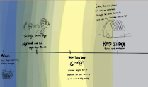 |


Here is my sketch:

First, we asked the members to make 1 sketch. After that, we gathered all of the sketches and decided on which one we would use. We brought this to Miss Jinchi and she suggested us to use a design that is more organic and not too organized looking. So here is the sketch that we picked:
After picking the sketch, there are several things that we need to consider. We need to make sure that the visual in the infographic can do more than just excite. They play an important role which is to help people understand and remember the contents. Other thing we need to consider is the style and the color.
Our target audience are non-local people, any ages from kids to elders. Therefore, we decided that we want to make the illustration more simplified. Aside from the time duration that is not effective to create realistic art, we believe that it is easier to attract the younger people with a simple and modern art style.
For the color palette, we had 2 choices. The reason why we chose the first one was because the colors are more natural. The colors of the beach represent Bali a lot, therefore we think it is a very suitable color palette for Nyepi.

For the second one, it is quite the opposite. The reason why we picked this is because our audience range is quite wide and the more colorful the color palette, the more interesting it will be seen by most people. We believe that people are more attracted to flashy colors rather than pale colors. Aside from that, we would like to let people know that Nyepi is not as gloomy as they think (since it is about silence), there are also other joyful ceremonies that some might not be aware of.

In the end, we chose the second color palette.


For the work progress, we divided our work. Azka and Luisa were in charge of the sketching. Azka firstly remade the sketch and then gave it to Luisa to be finalized. Luisa then offered the elements to the rest of the members to be traced in Adobe Illustration.
Progress:


 |
| rough sketch by Azka |


 |
| final sketch by me |


After this, we continued with the Instagram account. Azka made the story animation, Luisa and Hansel made the logo, and the rest were helping us in finding the articles to be put in the posts.
Our Instagram:

FEEDBACK
REFLECTION


Comments
Post a Comment