ADVANCED TYPOGRAPHY/ Task 3: TYPE EXPLORATION & APPLICATION
 |
30.05.2022 (Week 10-Week 14)
Luisa Audrey / 0348741 / Bachelor of Design in Creative Media
Advanced Typography
Task 3 - Type Exploration & Application
LECTURE
ADVANCED TYPOGRAPHY: Perception and Organization
Perception is “the way in which something is regarded, understood, or interpreted”. So, is perception what you see—and therefore understand—or what you are manipulated into seeing and understanding?
Perception in typography deals with the visual navigation and interpretation of the reader via contrast, form and organisation of the content. Content can be textual, visual, graphical or in the form of colour. However our focus today is in typography.
So how does contrast work? And what does form entail?
CONTRAST
 |
| contrast |
Carl Dair on the other hand adds a two more principles into the mix; texture and direction “to make design work and meaning pop out — clearly and unambiguously, and with flair.” via the use of contrast in typography.
Contrast / Size
A contrast of size provides a point to which the reader’s attention is drawn. For example if you have a big letter and a small letter you will obviously see the big letter first before the small. The most common use of size is in making a title or heading noticeably bigger than the body text.
 |
| Contrast / Size |
Contrast / Weight
Weight describes how bold type can stand out in the middle of lighter type of the same style. Other than then using bold, using rules, spot, squares is also provide a “heavy area” for a powerful point of visual attraction or emphasis, therefore not only types of varying weight.
 |
| Contrast / Weight |
Contrast / Form`
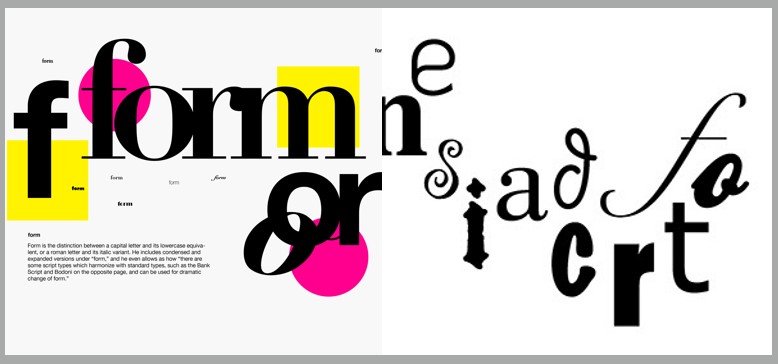
Contrast of form is the distinction between a capital letter and its lowercase equivalent, or a roman letter and its italic variant, condensed and expanded versions of typeface are also included under the contrast of form.
 |
| Contrast / Form` |
Contrast / Structure
Structure means the different letterforms of different kinds of typefaces. For example, a monoline sans serif and a traditional serif, or an italic and a blackletter.
 |
| Contrast / Structure |
Contrast / Texture
By putting together the contrasts of size, weight, form, and structure, and applying them to a block of text on a page, you come to the contrast of texture. Texture refers to the way the lines of type look as a whole up close and from a distance. This depends partly on the letterforms themselves and partly on how they’re arranged.
Contrast / Direction
Contrast of direction is the opposition between vertical and horizontal, and the angles in between. Turning one word on its side can have a dramatic effect on a layout. Text blocks also have their vertical or horizontal aspects of direction. Mixing wide blocks of long lines with tall columns of short line can also create a contrast.
Contrast / Colour
The use of color is suggested that a second color is often less emphatic in values than plain black on white. Therefore it is important to give thought to which element needs to be emphasized and to pay attention to the tonal values of the colors that are used.
 |
| Contrast / Colour |
Form
For refers to the overall look and feel of the elements that make up the typographic composition. It is the part that plays a role in visual impact and first impressions. A good form in typography tends to be visually intriguing to the eye; it leads the eye from point to point, it entertains the mind and is most often memorable.
 |
| Form |
Organisation / Gestalt.
Gestalt is a german word meaning the way a thing has been “placed” or “put together”. Gestalt Psychology is an attempt to understand the laws behind the ability to acquire and maintain meaningful perceptions.
 |
| Gestalt 6 principles |
INSTRUCTION
<iframe src="https://drive.google.com/file/d/1L5PA28zz66ylvETb4NdDxCG_H_Nr1s5U/preview" width="640" height="480" allow="autoplay"></iframe>
For the final task, we were asked to create a typeface that solves a problem or it can also be an exploration.
The first thing I did was looking for a problem. I tried so hard to look for problems but what came up to my mind the first time was to fix a brand that doesn't compliment the product. I tried looking for several food product and this is what I found.
 |
| Fig 1.1 Proposal, 6.26.2022 |
There is this brand called SunnyD that stand out the most for me but not in a good way. SunnyD is an orange juice brand that which I think looks like a cleaning product. Even the packaging looks like a cleaning product. My goal is to rebrand everything and make SunnyD a whole new logo that fits the product.
So the first thing I did was looking for a juice typeface. I came up with 2 sketches, but Mr. Vinod said both of them still don't look like juice typefaces.
.JPG) |
| Fig 1.2 First sketches, 6.26.2022 |
So I tried to look for several references:

.jpg)

Fig 1.3 Ideas & References 6.26.2022
Here is my sketch:
.JPG) |
| Fig 1.4 Final Sketch, 6.26.2022 |
After having the sketch, I moved them to Illustrator.
Personally I had a hard time doing the number because it was so hard, but in the end I managed, so here is the end result of the entire typeface.
 |
| Fig 1.5 Digitalized, 6.26.2022 |
I showed this to Mr. Vinod and he said it works for my logo. He asked me to continue with what I was doing. He also suggested me to kern it closer for the logo.
The next thing I did was creating the logo. I also created big S and D to make the brand SunnyD looks better.
.png) |
| Fig 1.6 Sunny D draft, 6.26.2022 |
This is the first draft I made for the SunnyD logo. I tried to improvise a little bit in the u and n part to make the logo more interesting. So far I was satisfied by how it looks.
The next thing I did was coloring the logo, I tried a lot of color palette and here is the look of the colored version.
 |
| Fig 1.7 Sunny D colored, 6.26.2022 |
Personally, I really like the bottom one, however I didn't know which one is better for Mr. Vinod. I'm afraid that the logo has too much graphic and he end up wouldn't like it. I tried to ask several friends as well but they all had the same opinion as me, they like the second one. So I tried to be positive and proceed with the second logo.
Here is the end result and the look of the logo:
 |
| Fig 1.8 Sunny D logo final, 6.26.2022 |
After this, I tried to think of the collateral. I spent SO MUCH TIME, looking for a good mockup bottle. Most of them either don't look good or don't look real. In the end, I tried to just make 1 and see how it will come out. This is the mockup design:


Fig 1.9 First Try Collateral, 6.26.2022
I was not satisfied at all with this one. I was also having a hard time trying to make the poster. But in the end, I tried to put my font in the fontlab first so I could refine my collateral and poster.
.png) |
| Fig 1.10 Font lab process, 6.26.2022 |
the kerning doesn't look that good, because there are some font that look a bit wider than the rest like the v, w, x, y. However, I personally think it still looks okay especially if you kern it again based on the texts the application.
The next thing I did was making the collaterals, I managed to find few nice packaging for the brand.
 |
| Fig 1.11 Collateral 1, 6.26.2022 |
This bottle definitely looks better than the previous one. At least for me, I like this one better. But I was not satisfied, I planned on making several packaging to make the brand more interesting. Here are the collaterals that I made:
 |
| Fig 1.12 Collateral 2, 6.26.2022 |
It would be nice to have a canned version of a juice. If you want something refreshing in the middle of hot weather, providing a canned juice and put it in the vending machine would be nice and beneficial for the company.
The next thing I did was making the small carton version.
 |
| Fig 1.13 Collateral 3, 6.26.2022 |
The reason why I made this is because usually kids would prefer to drink from small carton because they drink less and it is less dangerous unlike the canned version one. it is also more environment friendly because it is made of carton paper.
The next one is the big carton.
 |
| Fig 1.14 Collateral 4, 6.26.2022 |
A lot of juice brand provides a bigger packaging to fit more drinks inside. A lot of customers also find that really useful especially if it already becomes one of their favorite drink. Aside from being more environment friendly, you can also keep the drinks for a week or more.
After all the collaterals, I made the poster, and here is the end result:
 |
| Fig 1.15 Poster, 6.26.2022 |
and here is the billboard poster version:
 |
| Fig 1.16 Poster Billboard, 6.26.2022 |
FINAL SUBMISSION:
 |
| Fig 1.17 Final Logo, 6.26.2022 |
 |
| Fig 1.18 Final Poster, 6.26.2022 |
 |
| Fig 1.19 Final Poster Billboard, 6.26.2022 |
 |
| Fig 1.20 Final Bottle Collateral, 6.26.2022 |
 | |
|
 | |
|
 | |
|
FEEDBACK
Week 10:
General Feedback: Mr. Vinod told us to find good idea to be done for the final project
Specific Feedback: I gave Mr. Vinod 2 ideas which are the Sunny D rebranding and Jokerman font recreate. Mr. Vinod chose Sunny D because it is more interesting. He also told me that the font sketch that I made didn't suit juice product, and I need to make it rounder and shorter.
Week 11:
-
Week 12:
General Feedback: From what I heard, I often recognize Mr. Vinod reminded us to make sure that the font that we create will be good in the execution and it fits the thing that we wanted to fix in the first place.
Specific Feedback: Mr. Vinod said that my font works and it definitely looks juicy. However, he also reminded me to make the kerning closer for the logo.
Week 13:
General Feedback: Mr. Vinod told us to listen to what he said last week and be careful with the application.
REFLECTION
Experience: Personally, this task was actually pretty fun. However, the time limit and the tasks from other modules made me struggle a lot. I was planning to make the whole uppercase, however I didn't have the time to do all of them and ended up only finalizing the S and the D. I also realized that the font that I was pretty hard to kern because of the inconsistent size, some of them appear a bit wider because of the style that I made, I just hope that it is still acceptable.
Observation: From what I learnt after making the font, I realized that everything needs to be measured properly, the ascender and descender of every alphabet has to be the same, or else in some case, some letters will look slightly bigger. Even if it is only a very little difference, the font may look imbalance. I also noticed that in the process of doing collateral, searching for the right mockup is actually pretty challenging. You have to look for the right packaging that suits your brand, and sometimes you will end up feeling like you get the wrong packaging.
Finding: I found that solving problems are not easy. I may not cover everything in the end. I tried to rebrand everything, however there might be something that I miss such as a particular style or color that I should have kept in order to make people recognize that it is the Sunny D they knew. However, when I tried to keep some of the elements, it didn't look good because the logo looks so much like a cleaning product to begin with. In the end, I went with my own way and found the way out, just hopefully it is acceptable enough because I worked pretty hard for this task.
FURTHER READING
 |
| Vignelli Canon on Design |
Part Two
The Tangibles
Paper Sizes
 |
| Paper Sizes |
The choice of paper size is one of the first of any given work to be printed. There are two basic paper size systems in the world: the international A sizes, and the American sizes.
These are the basic DIN sizes in mm. for :
A0, 841x1189 - A1, 594x841 - A2, 420x594 -
A3, 297x420 - A4, 210x297 - A5, 148x210 -
A6, 105 x148 - A7, 74x 105 - A8, 52x74 -
A9, 37x52 - A10, 26x37.
The A4 is the basic size for stationary. Two thirds of it is a square, a nice economical happenstance resulting from the golden rectangle.
It is important a designer is fully aware of the printing process and the papers required for the most efficient and economic production of the printed work. The market offerings are wide but indiscriminate, governed more by the rules of competition than by standards.
Grids, Margins, Columns and Modules
 | |
| Grids, Margins, Columns and Modules |
For us Graphic Design is “organization of information.” There are other types of graphic design more concerned with illustration or of a narrative nature. Nothing could be more useful to reach our intention than the Grid. The grid represents the basic structure of our graphic design, it helps to organize the content, it provides consistency, it gives an orderly look and it projects a level of intellectual elegance that we like to express.
A Company Letterhead
 |
| A Company Letterhead |
After setting the outside margins at 10mm. from the edges of the paper, we will divide the space in three columns, leaving the left one blank for the use of a logo, or names, or just empty space. The remaining two columns will be for the text. The overall asymmetrical layout conveys a feeling of modernity.
Grids for Books
 |
| Grids for Books |
For the design of a book the grid provides again structure and continuity from cover to cover.
In a picture book, according to the content, the grid could have a number of columns and sub-columns to organize the information accordingly.
Typefaces The Basic One
 |
| Typefaces The Basic One |
The advent of the computer generated the phenomena called desktop publishing. This enabled anyone who could type the freedom of using any available typeface and do any kind of distortion. It was a disaster of mega proportions.
I still believe that most typefaces are designed for commercial reasons, just to make money or for identity purposes. In reality the number of good typefaces is rather limited and most of the new ones are elaborations on pre-existing faces.


Comments
Post a Comment